E-commerce
Rich Solar
https://richsolar.com/What’s the catch?
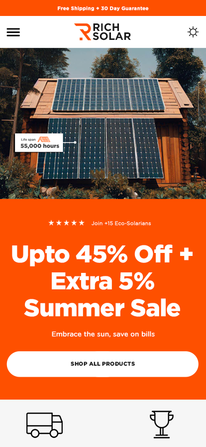
We're revamping this page to boost conversions to the max. Take a look at how we've amped up the tried-and-true conversion-centered design with an eco-friendly color scheme.

Choosing the Right Theme
We opted for the orange and blue theme because we've observed that energy and electricity conversion are associated with these vibrant colors. By choosing this theme, which happens to be the default for our brand, we aim to convey the energy-saving aspect.
#fe5000
#ffffff
#1a1a1a


Front-end development
We made it a priority to develop a user-friendly interface that's not only easy to navigate but also visually appealing. Our approach involved clean, simple designs featuring clear calls to action, encouraging users to interact with the site. Since a majority of users access the internet on their phones, ensuring a seamless user experience across all devices was crucial.