Food & Drinks, E-commerce Store
Capecode
https://capecode.com/What’s the catch?
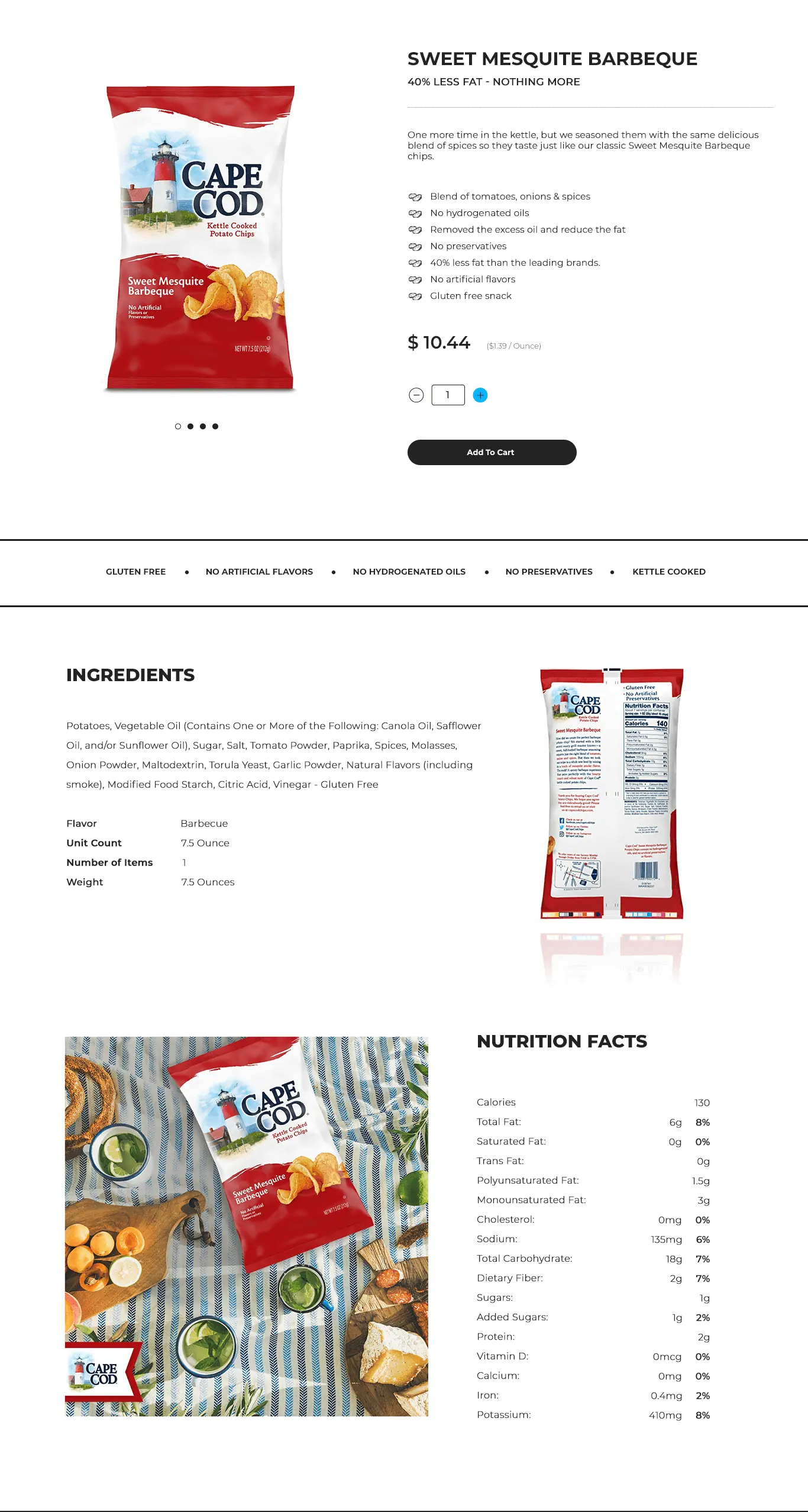
While designing the website to maximize conversions, we increased customers' likelihood of purchases and boosted the business's overall revenue. We improved user experience: A website that is easy to use, visually appealing, and mobile-responsive can improve the user experience and encourage customers to return to the site in the future.

Choosing the Right Theme
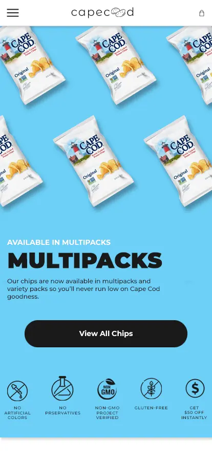
Plain white color is often associated with cleanliness and purity, and it may not necessarily represent health in the context of potato chips; therefore, it may be more effective to focus on other aspects of the product's appeal, such as taste, texture, or ingredient quality, rather than relying solely on the color of the packaging or website design to communicate health benefits.
#6dcff6
#ffffff
#000000


Front-end development
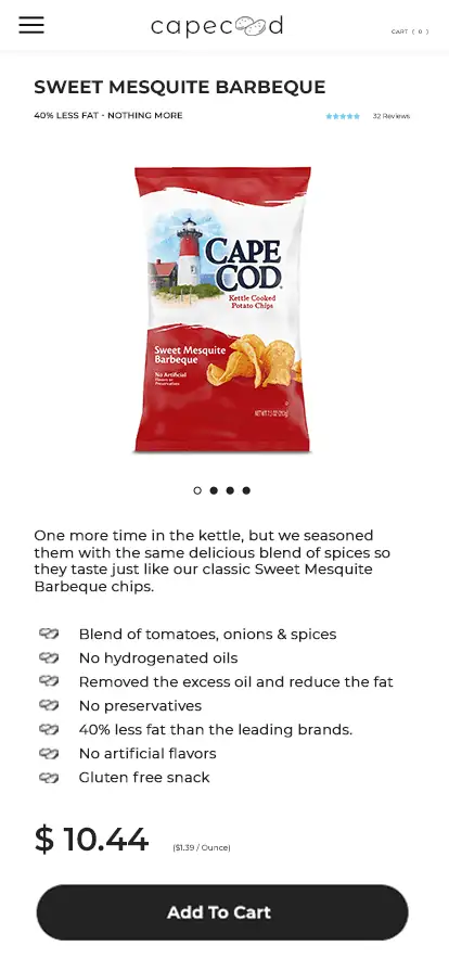
With many customers shopping for snacks on mobile devices, ensuring the website is optimized for mobile use is essential. With a white color theme, white space can be used effectively to create a clean and modern aesthetic. Use white space to emphasize important elements of the website and make it easier for customers to find what they're looking for.